Designing a System That Scales
Building a unified design foundation across products, teams, and code.
Role
Senior Product Designer - Design System Lead
Team
Design & Engineering - cross-product, 8 apps
Scope
Org-wide infrastructure - tokens, components & governance
My Role & Impact
I built and owned this design system as a product - from the initial Tailwind audit and token architecture, through the Figma–Storybook parity model, to the governance process that kept it from fragmenting as it scaled to 8 apps. I designed the contribution workflow, wrote the documentation standards, and mentored the design team away from screen-drawing toward pattern-based thinking.
Owned: Full system - tokens, components, governance model & team adoption
Drove: Figma–Storybook parity strategy & the "Three-Way" contribution governance
Outcome: 3× faster design-to-dev · 100% visual consistency across 8 apps · accessibility standard from day one
100%
Reduced inconsistencies
3x
Increased design-to-dev speed
8
Scaled system across products
The Challenge: Systemic Fragmentation
As the company evolved into a multi-product ecosystem, the UI layer remained fragmented. Design decisions were made directly in development using a raw Tailwind library without a centralized design strategy.
This created three critical risks:
Accessibility Liability: Inconsistent contrast and focus states were a major barrier for our primary users, who often navigate with visual disabilities or assistive technology.
Brand Dilution: A disjointed user experience across products, undermining trust in a sensitive service area.
Engineering Debt: Developers were "reinventing" the same components across different products, slowing down delivery and increasing maintenance costs.
Lack of Parity: There was no shared "language" between Figma and code, leading to friction during handoffs and QA.


Strategy: Bridge, Don't Replace
My strategy was to build a system that felt like a natural extension of the developer workflow, not a hurdle.
The Tailwind Audit: Instead of replacing the engineering foundation, I audited the Tailwind library and extracted only the essential components. This ensured immediate "dev-friendliness" and high adoption rates.
Foundations-First: I prioritized Variables (Tokens) over components. By defining the "DNA" (colors, spacing, typography) first, we ensured that every future component would be accessible by default.
Alignment over Aesthetics: I focused on aligning cross-functional teams on a Governance Model to ensure the system would grow through process, not improvisation.
System Work: Infrastructure over Interface
I treated the design system as a product, focusing on technical architecture that mirrors the codebase.
Accessibility as a Foundation:
Typography: Selected Inter for its high legibility and x-height.
Color Variables: Created a semantic naming system. Every token was validated against WCAG 2.1 AA/AAA standards to support veteran users.
Focus States: Engineered high-visibility focus rings specifically for keyboard-only navigation.
Design-Code Parity: I structured the Figma library to mirror the Storybook architecture. If I named a variable
brand-primary-hover, the developer saw the same token in their code.Variable Strategy: Implemented Figma Variables for spacing, radii, and colors, allowing us to test "Themes" (like High Contrast Mode) instantly across all 8 apps.


Delivery & Collaboration: Driving Adoption
A system is only successful if people use it. I focused on building a "Contribution Culture."
Tailored Communication: I presented the system differently to each audience:
To Engineers: Focused on tokens, props, and reducing custom CSS.
To Managers: Focused on speed-to-market and cost reduction.
Governance Loop: Established a dedicated Teams channel for component requests. Every update was a partnership between a dedicated designer and an engineer to ensure the system remained lean.
Education: Mentored the design team to stop "drawing screens" and start "building with patterns," shifting the team’s maturity from execution to orchestration.
Management & The Contribution Loop
As the system grew from a "form-kit" to an enterprise-wide asset supporting 8 applications, the biggest risk was fragmentation—teams either creating "rogue" components or over-complicating the existing ones. I established a formal governance model.
1. The "Three-Way" Check
To prevent the design system from becoming a "junkyard" of one-off components, every request via our Teams channel was filtered through three questions:
Is it Universal? Does more than one application (out of the 8) need this?
Is it a Pattern or a Component? Can this be solved by combining existing components (e.g., a Card + a Button)?
Is it Accessible? Does the proposed change maintain our strict contrast and focus-state standards for veterans?
2. The Request Lifecycle
I designed a clear workflow to ensure no request disappeared into a "black hole," which maintained high developer trust:
Discovery: A developer or designer submits a request in the Teams channel.
The "Sync" Meeting: A 15-minute technical review between the Lead Designer (System Owner) and Lead Developer to discuss API props and Figma constraints.
Drafting: The component is built in a "Beta" Figma file and a "Experimental" Storybook branch.
Validation: Final QA check for accessibility (keyboard tab-order and screen reader labels).
Promotion: The component is merged into the Main Library and documented.
3. Documentation & Parity
We enforced a "Twin-Track" documentation rule. A component was not considered "Done" until:
In Figma: It utilized Variables for spacing/color and included "Usage Guidelines" (When to use vs. When not to use).
In Storybook: It mirrored the Figma naming convention exactly (e.g.,
Input/Veteran-High-Contrast). This eliminated the "translation layer" between design and code.


Key Outcomes
Engineering: 3× faster design-to-dev handoff - components became "drag-and-drop" rather than "custom-built," eliminating the translation layer between Figma and Storybook.
Engineering: Scaled to 8 applications with 100% visual and functional consistency - the system absorbed new product needs without fragmentation, validating the governance model.
User: 100% of new features accessible for veterans from day one - WCAG 2.1 AA/AAA compliance and high-visibility focus states baked into the token layer, not retrofitted.
Org Impact: Became the organisation's single source of truth - Figma and Storybook are now the reference point for PMs, QA, and stakeholders, not just designers and engineers.
Org Impact: Shifted team maturity from execution to orchestration - designers moved from drawing screens to building with patterns, measurably improving the consistency and speed of the whole design org.
Other projects

Building Faster: An AI-Assisted Homepage Redesign
Using Claude Code and Figma to define a design system, iterate on a homepage, and ship a token-based prototype - all in one connected workflow.
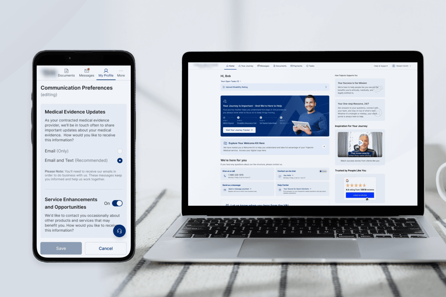
Digitizing the Veteran Journey: Connecting the Dots
Transforming a complex, phone-based claim process into a clear, task-driven digital experience.
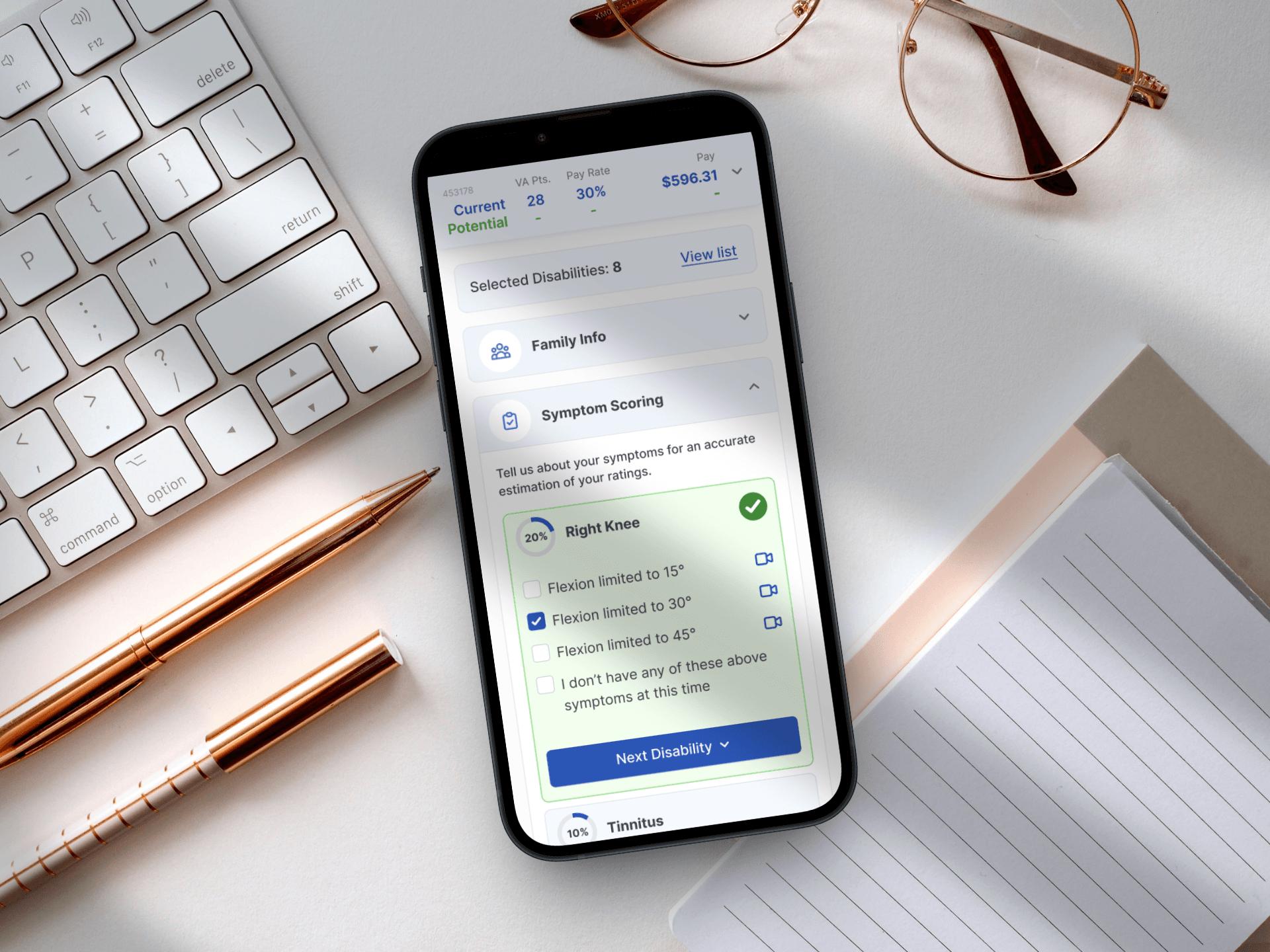
Designing for Service: A Mobile-First Veteran Benefits Calculator
Simplifying the path to government benefits by bridging the gap between complex legal algorithms and human-centered design.
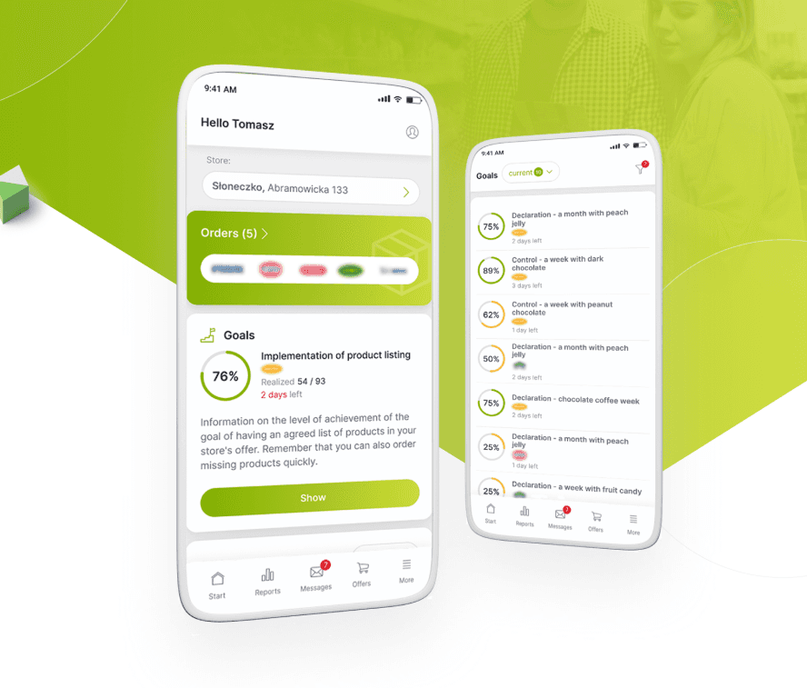
From Excel Chaos to a Unified Retail Powerhouse
Orchestrating the end-to-end design and strategy of a responsive platform that unified fragmented legacy workflows into a high-velocity digital marketplace.