Digitizing the Veteran Journey: Connecting the Dots
Transforming a complex, phone-based claim process into a clear, task-driven digital experience.
Role
Lead Product Designer
Team
R&D - Designer, UX Writer, PMs, Engineering
Scope
Consolidating 4+ apps into one unified platform
My Role & Impact
I owned the end-to-end design vision for consolidating four disconnected apps into a single veteran portal - from the "Connecting the Dots" strategy deck that secured stakeholder buy-in, through every user flow and final handoff. I drove the pivot to a Task Center architecture, brokered the cross-department UX Writer collaboration, and championed the Appointment Center to solve the critical gap that 52% of users couldn't answer the phone.
Owned: Full product vision - IA, all UX flows & final UI across 4 merged apps
Drove: Stakeholder alignment strategy that secured the consolidation green light
Outcome: 74% higher task engagement · 58% Help Center adoption · business model shifted to digital-first
74%
of users reported higher engagement with tasks
58%
of users actively utilized the tailored Help Center
4+
disparate applications consolidating into a platform
When I joined the R&D department in 2022, the company’s business model relied on human-to-human hand-holding. Veterans were guided through the complex VA claim process almost entirely by phone.
The Challenge
The digital landscape was a mess of "silos." We had a portfolio of separate apps: one for filling forms, one for the "Document Center," one for signatures, and another for referrals. If a veteran wanted to check their status, they had to call. This created a massive operational burden and a disjointed experience for users who were often elderly and dealing with disabilities.
We didn't just have a "bad UI." We had a fragmented system, increasing engineering costs, and limiting our ability to scale without hiring more call center staff.
Strategy: Connecting the Dots
I realized we needed to move away from "apps" and toward a unified environment.
Diagnosis: Users were lost because their data lived in four different places.
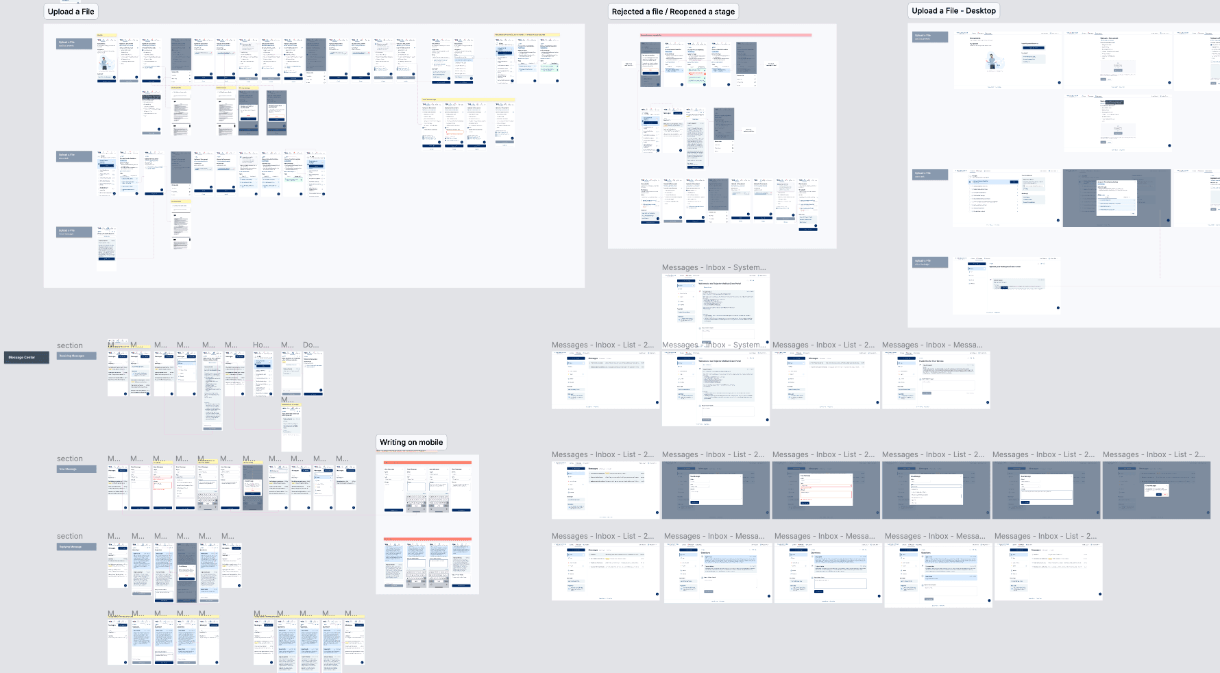
The Proposal: Combine all applications into a single logical portal. I mapped out the core "Happy Paths" and drafted mobile-first wireframes (since 65% of our users are on mobile).
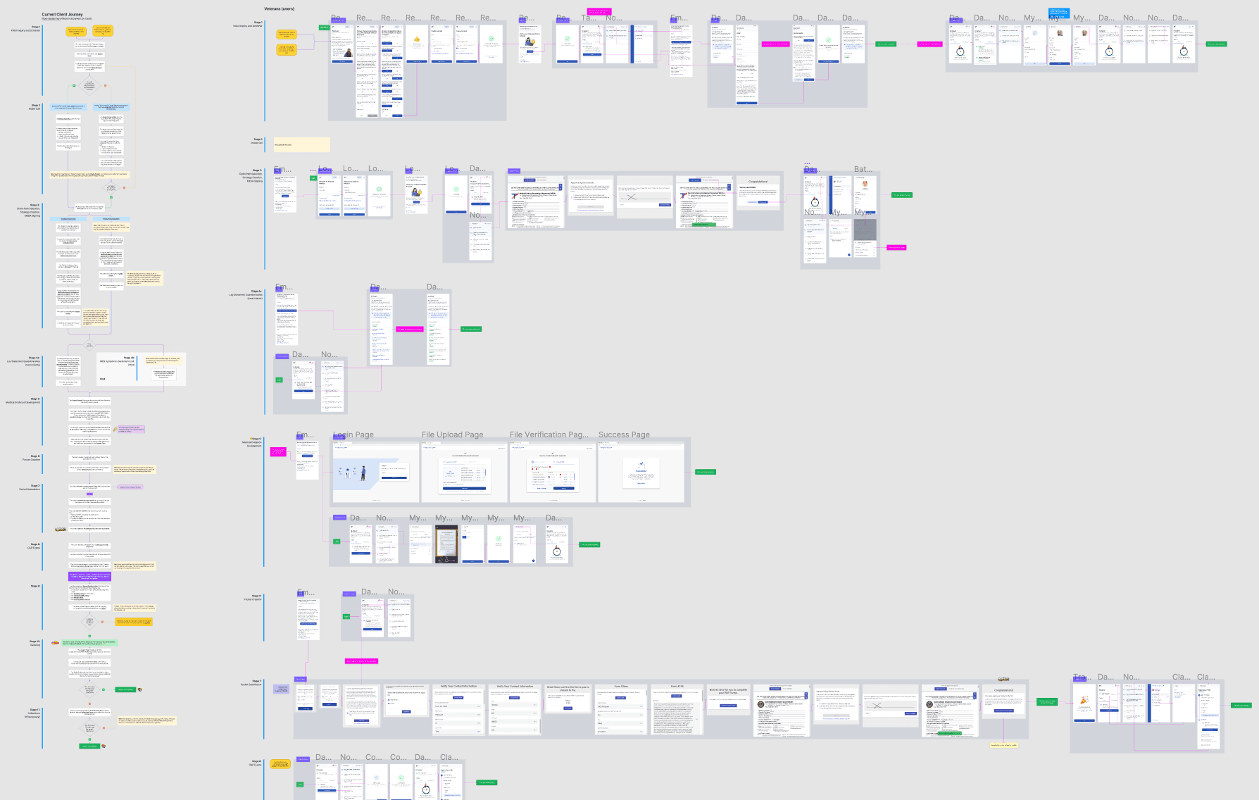
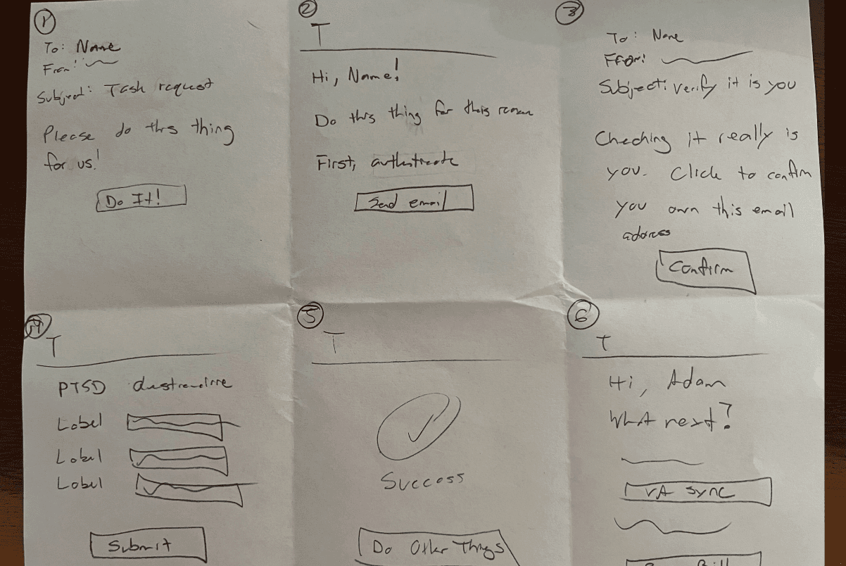
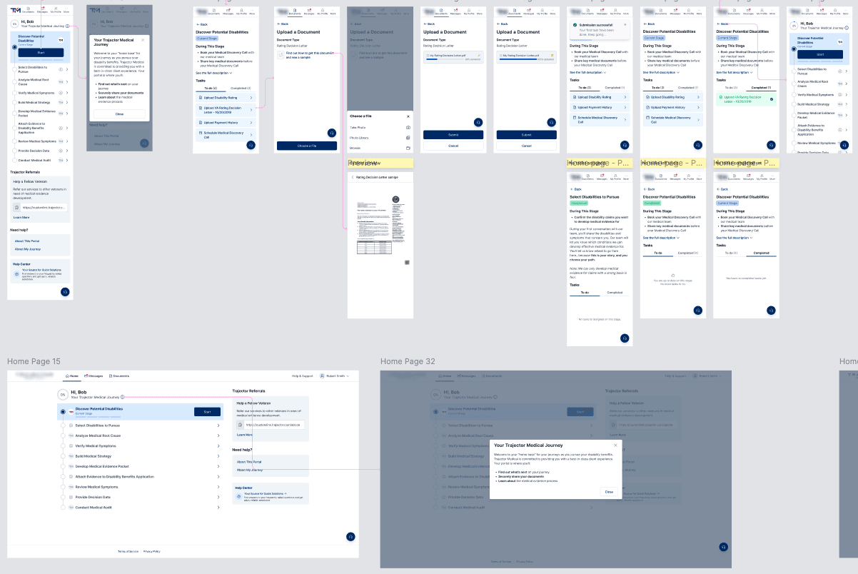
The Pivot: I discovered a UX Writer in another department had independently mapped a similar journey. Instead of competing, we merged our work. We turned his journey map into a "Connected Dots" diagram that illustrated the entire lifecycle—from the first login to receiving VA payments. Based on it, I prepared the entire veteran user journey screens, from logging in to sending a claim to the VA, to receiving payment for services.
Alignment: We presented this "unified vision" to stakeholders to get the green light for the Veteran Portal.
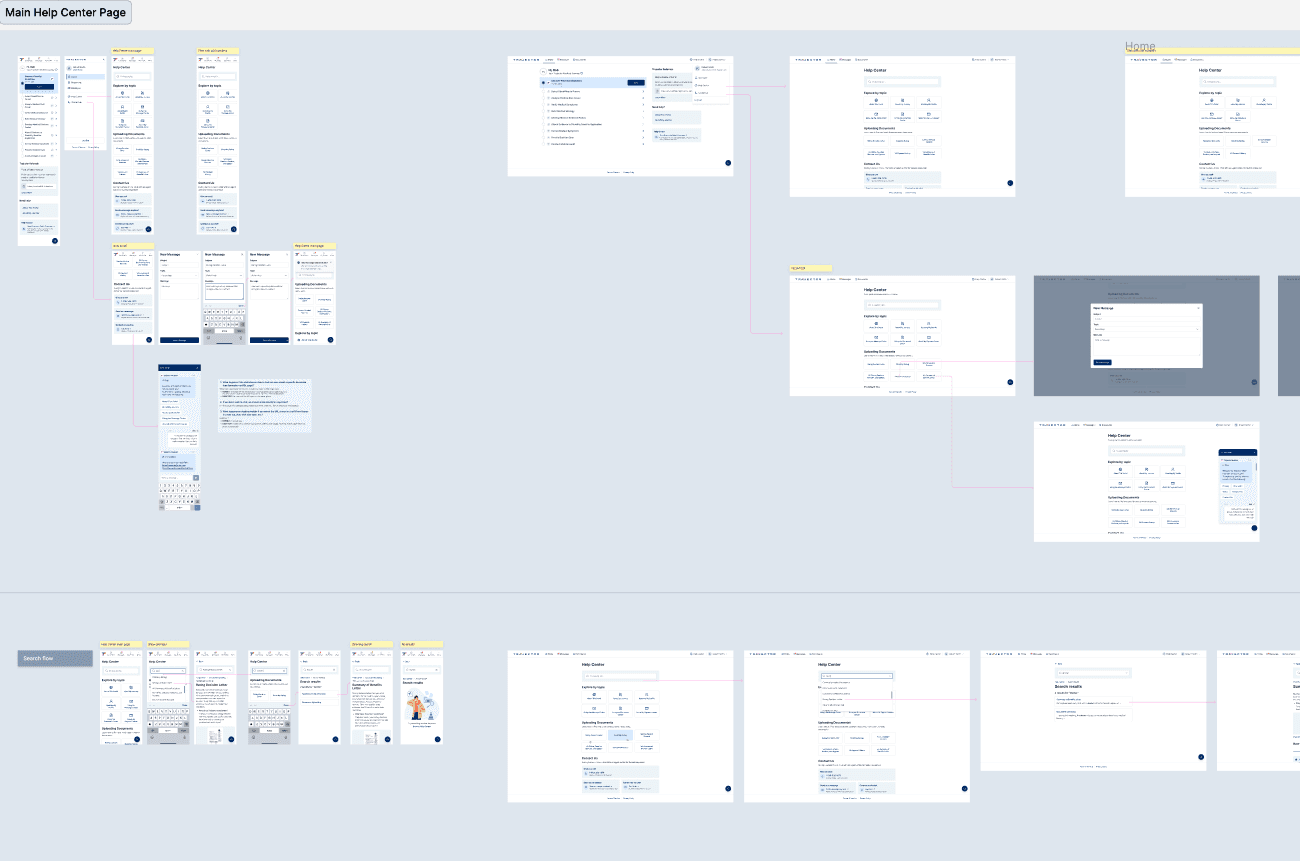
System Work: From Chaos to Cohesion
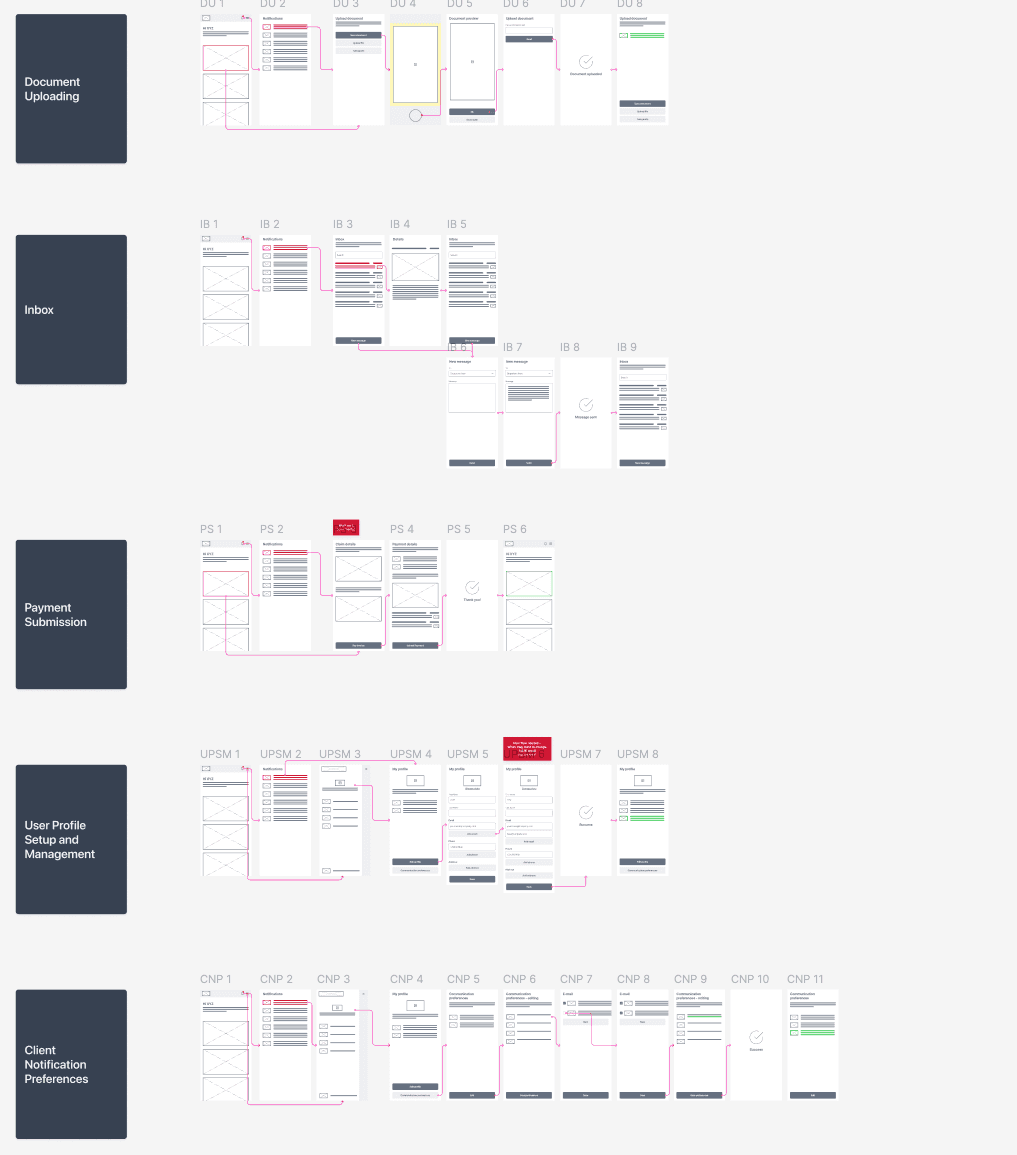
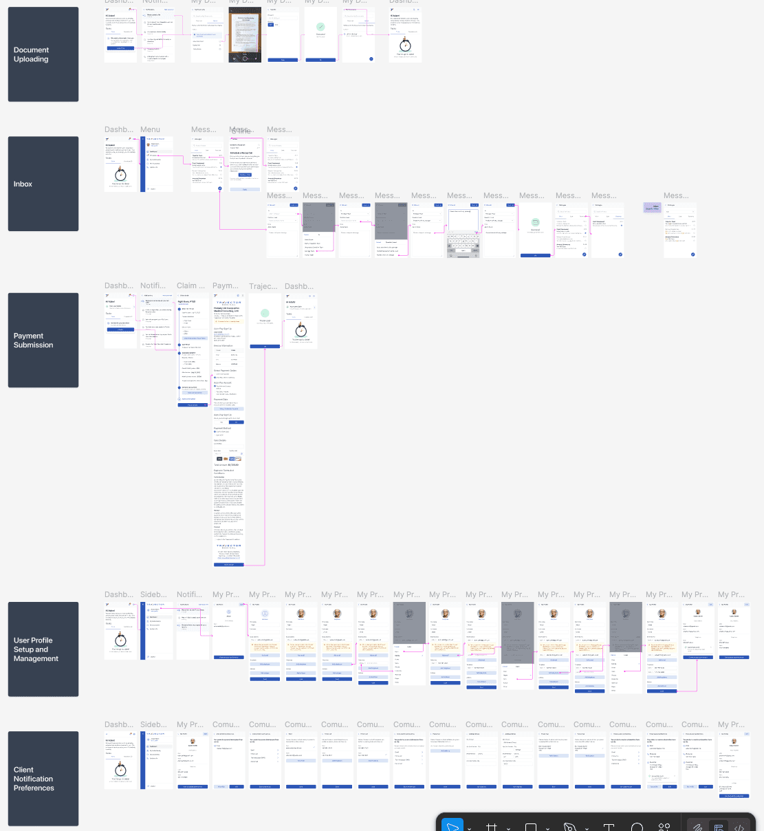
After the Pivot presentation to stakeholders, we received positive feedback, and that was the moment we started working on the veteran portal. The next step was to expand all user flows, paying particular attention to edge cases and validations. To make everything understandable and easy to correct, the flows and views were expanded.
The Systemic Solution
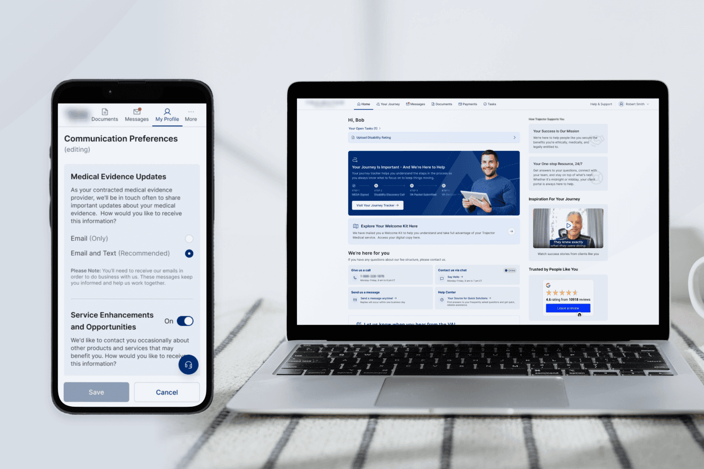
Task-Oriented Architecture: Based on user feedback, we moved away from a traditional dashboard to a Task Center. This clearly showed users exactly what they needed to do next, removing anxiety about missing required actions, common among veterans.
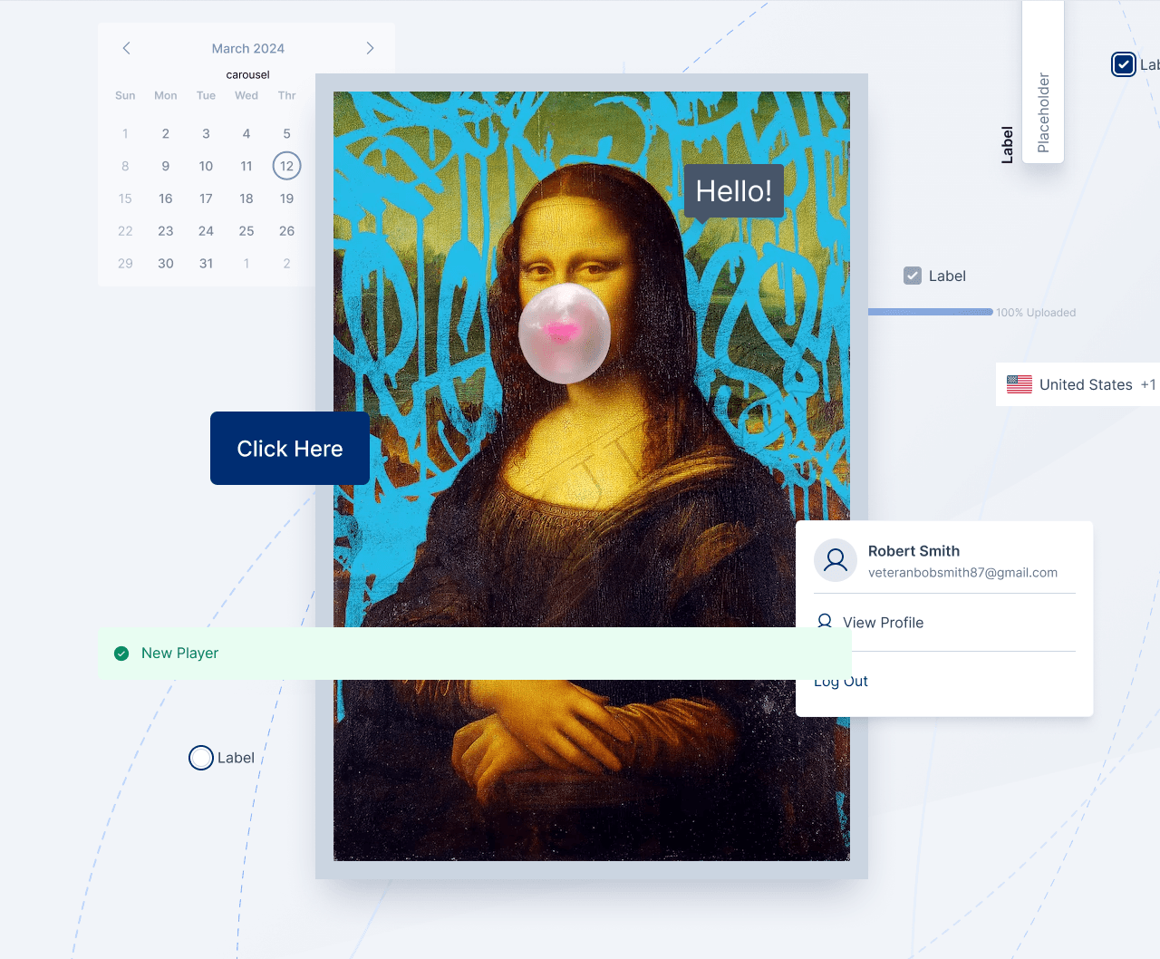
Design System Integration: I used the initial components from the company’s design system to ensure the portal felt like a trusted, official extension of the brand.
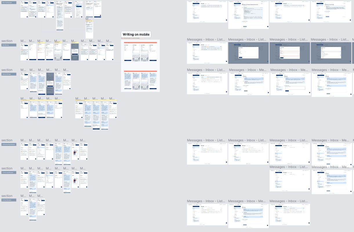
Delivery & Collaboration
The UX Writer Partnership: By aligning with the UX Writer early, we ensured the "voice" of the portal was as supportive as the UI.
Internal Dogfooding: We conducted research with our own employees who are veterans. Their "ground truth" feedback led to rapid iterations on the Task Center logic.
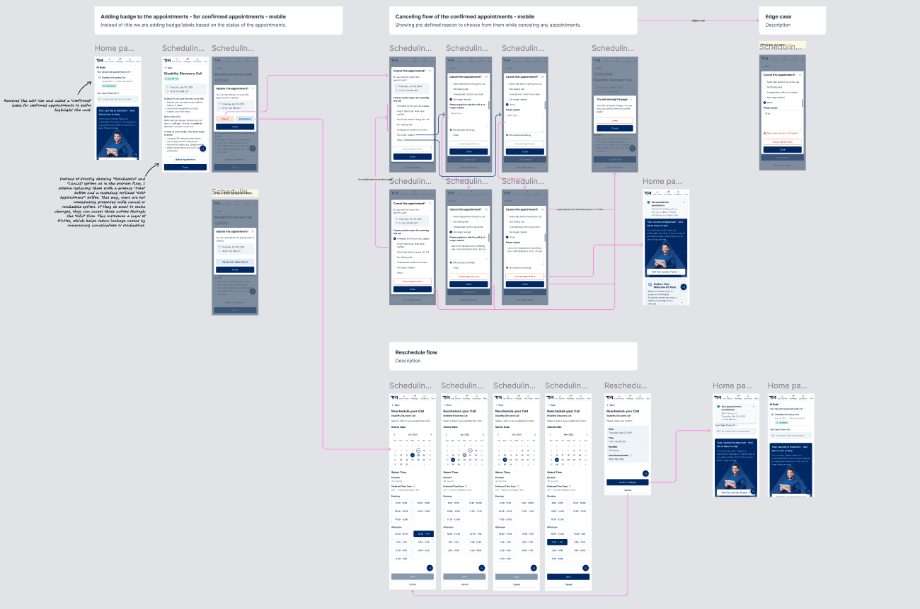
Handling Constraints: We realized 52% of users can't answer the phone when we call. To solve this, we built an Appointment Center, allowing users to confirm, change, or cancel calls on their own terms.
The Help Center: We added a tailored section to describe the user's path through the portal, reducing the "What happens now?" anxiety. In addition, we illustrated a system-wide Zoom utility to explain how to use it.
Key Outcomes
User: 74% of users reported higher engagement when given specific "Next Step" tasks - validating the shift from a traditional dashboard to a Task Center architecture.
User: 58% of users actively used the tailored Help Center, directly reducing inbound support volume without any additional staffing.
User: 52% of users who previously missed calls now self-manage their schedules autonomously via the Appointment Center - a problem the product had never been designed to solve before.
Business: Shifted the company's operating model from a call-heavy, human-to-human service to a scalable digital-first platform - enabling growth without proportional increases in support headcount.
Engineering: Consolidated 4+ separate codebases into one unified environment, significantly reducing maintenance overhead and unblocking engineering velocity for future features.
What I Learned
1. Breaking Down Organizational Silos is a Design Skill
The discovery of a UX Writer in another department working on a similar journey map was a pivotal moment. I learned that as a designer, my job isn’t just to design the interface, but to design the communication between departments. By merging our work instead of competing, we created a much stronger "Source of Truth" that had immediate stakeholder buy-in.
2. Solve for "The Missing 52%"
A huge realization was that 52% of our users simply couldn't answer the phone when we called. This taught me to design for the "Offline Gap." Instead of just trying to make the phone calls better, we built the Appointment Center to give that control back to the veteran. This proved that sometimes the best digital solution is one that fixes a real-world scheduling conflict.
3. System Thinking Trumps Feature Thinking
When I started, we had four separate apps. By "connecting the dots," I learned that users don't care about "apps"—they care about their status. Transitioning the UI to a state-aware, task-oriented engine was much more effective than just redesigning four different dashboards.
Other projects

Building Faster: An AI-Assisted Homepage Redesign
Using Claude Code and Figma to define a design system, iterate on a homepage, and ship a token-based prototype - all in one connected workflow.
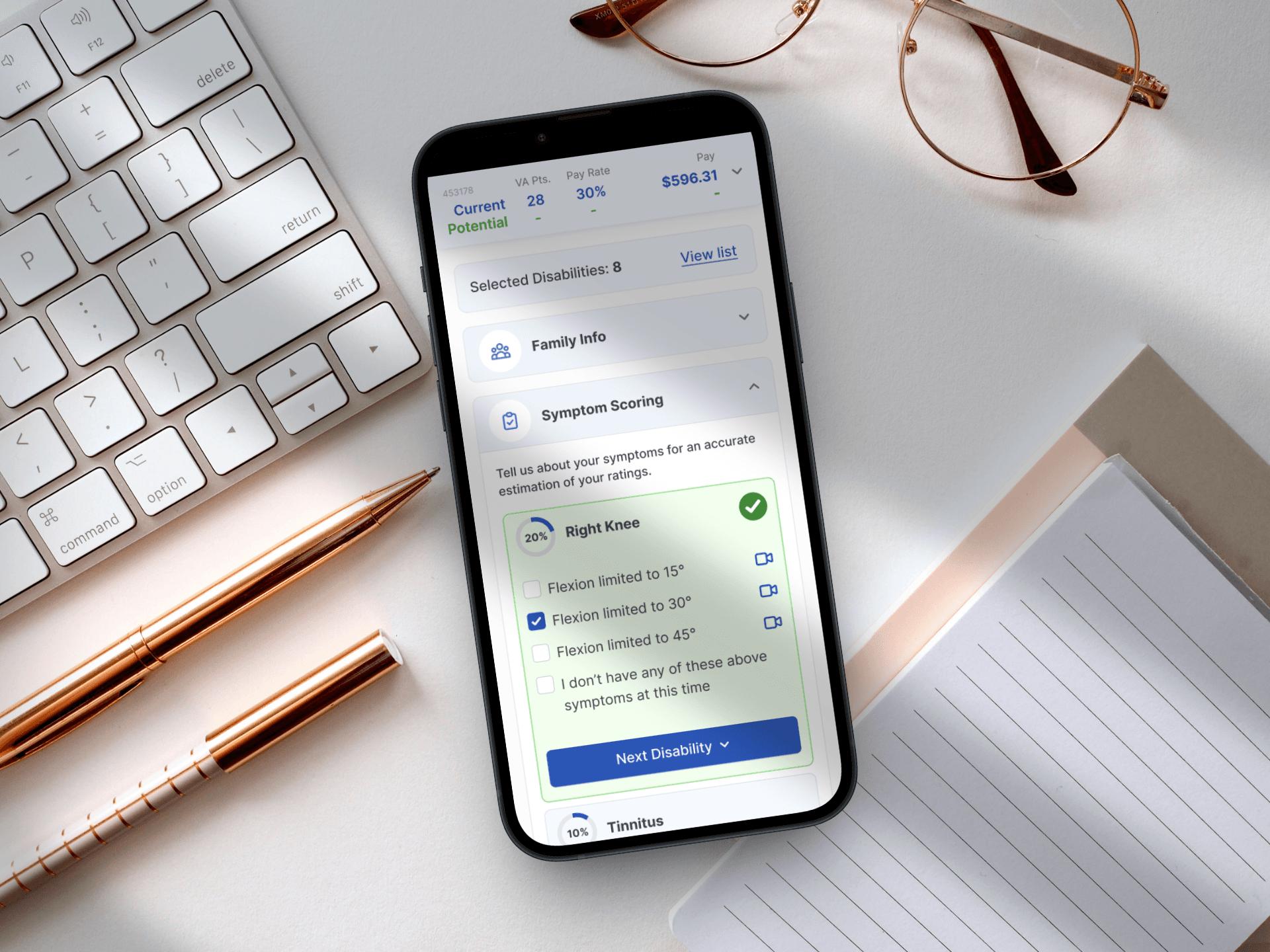
Designing for Service: A Mobile-First Veteran Benefits Calculator
Simplifying the path to government benefits by bridging the gap between complex legal algorithms and human-centered design.
From Excel Chaos to a Unified Retail Powerhouse
Orchestrating the end-to-end design and strategy of a responsive platform that unified fragmented legacy workflows into a high-velocity digital marketplace.
Designing a System That Scales
Building a unified design foundation across products, teams, and code.