From Excel Chaos to a Unified Retail Powerhouse
Orchestrating the end-to-end design and strategy of a responsive platform that unified fragmented legacy workflows into a high-velocity digital marketplace.
Role
Lead Product Designer
Team
Cross-functional - Eng, PM, Sales Stakeholders
Scope
Full platform architecture + Design System · Sep 2019 – Jan 2022
My Role & Impact
Over nearly three years, I architected this platform from a blank canvas - defining the multi-persona IA, leading three rounds of user research and testing, and simultaneously founding the Design System that future-proofed the codebase. I drove the shift from a feature-flat dashboard to a prioritised "Top 3 Golden Path," and established documentation standards that were adopted company-wide.
Owned: Full platform architecture, Design System foundation & 3 years of iteration
Drove: Research strategy, IA overhaul & company-wide shift to system-first design culture
Outcome: 91% user preference · 1,000+ users onboarded · 4 enterprise clients cited platform as key factor
100%
Increase in market interest within the sector
1,000+
active users successfully onboarded
91%
of users preferred the new design
The Strategic Mission
In 2019, I was tasked with architecting a ground-up retail platform (Responsive Web) to digitize field sales. The goal was to replace manual, error-prone processes with a self-service environment that empowered store owners and reduced reliance on sales representatives.
The Challenge: Operational Fragmentation
The retail landscape suffered from "information asymmetry." Store owners managed inventory, goals, and deliveries across disconnected Excel files and legacy local software.
The Senior Perspective: This wasn't just a UI problem; it was a systemic bottleneck. The lack of a unified data layer across the supply chain suppressed the company’s growth by making real-time business goal tracking impossible and increasing the operational cost of field sales.
Strategy: Diagnosis & Technical Alignment
I moved beyond digitizing spreadsheets to focus on Platform Consolidation:
Multi-Persona Architecture: Designed a flexible system serving both "Strategic Oversight" (Chain Managers) and "Tactical Execution" (Single Store Owners).
Hardware Agility: The application should be responsive, as users will be able to do many things in the field. It should also be compatible with various devices, even older phone models.
Strategic Alignment: Responding to the business requirement for a unified digital ecosystem, I architected a dedicated Design System. This moved the organization from a "siloed project" mindset to a "scalable platform" model, effectively future-proofing the product and preventing technical debt from day one.


System Work: Architecting the Modular Engine
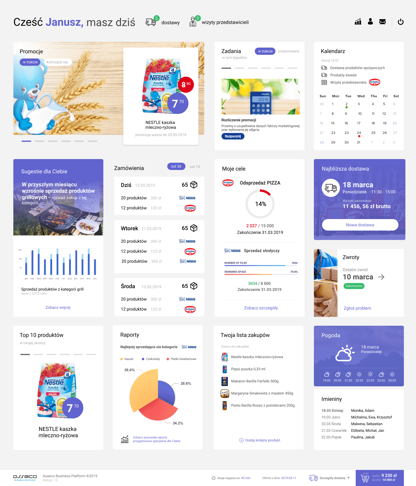
We began our research. We searched for similar solutions among competitors. We focused on a select few, such as: Eurocash, Comarch, Frappka, Lildl Plus, Pepper, and Żappka. Based on the collected information and screens, the first wireframe was created (mid-fidelity web wireframes). The heart of the application was the dashboard, where we wanted to place most of the functionality in the form of cards.
75% of Users Felt Overwhelmed — Opportunity for Flexibility
I conducted interviews with users and usability tests with individual store owners to discover the pain points associated with the application. Most of them were overwhelmed by the amount of functionality. In addition, using card sorting, we identified key functions (prioritization) and built a navigation structure for the site.
I shifted from a flat list of features to a Modular Widget Engine.

91% of Users Preferred the New Design After Testing
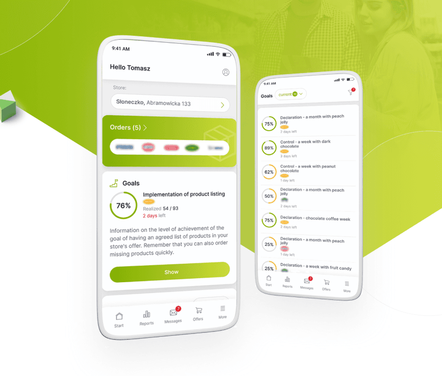
I reduced design friction, which strengthened user flow. The "Top 3" Framework: Based on card-sorting, I prioritized Tasks, Orders, and Business Goals into a "Golden Path" dashboard, nesting secondary features into logical categories.
We also created mobile screens for the next round of user testing.


Continuously Expand and Iterate
I continued with iterative research and testing cycles, validating successive prototype versions (v1–v3) with users. Each iteration refined the homepage layout, feature prioritization, and overall experience. In parallel, we expanded both web and mobile versions and evolved the information hierarchy to support new functionalities, including promotions/contracts. While the interface evolved, the core structure established during the initial research remained consistent.


Delivery: Leading through Collaboration
Engineering Sync: Delivered a component-based handoff that allowed developers to pull standardized code, significantly increasing development velocity.
Constraint Management: When new features (like Promotions) were added late in the cycle, the modular card system allowed us to integrate them without breaking the core user flow.
Mentorship: I established documentation standards and design principles that were eventually adopted by the broader design organization.
Key Outcomes
User: 91% of users preferred the new design over legacy workflows in usability testing - the direct result of moving from a feature-flat dashboard to a prioritised "Top 3 Golden Path" structure.
Business: 4 new enterprise clients signed at launch, each citing the platform as a key factor in their decision - directly linking design quality to revenue.
Business: 100% increase in market interest within the sector and 1,000+ active users successfully onboarded at launch - scaling from zero with no significant support overhead.
Engineering: Measurable increase in engineering velocity via the Design System - component-based handoff allowed developers to pull standardised code rather than building custom UI per feature.
Org Impact: Shifted the company from a dev-led UI culture to a system-first design culture - the documentation standards and design principles established here were adopted by the broader design organisation.
What I Learned
1. Complexity requires Curation, not just Simplification
Early research showed that 75% of users felt overwhelmed. I learned that in B2B retail, you can’t always "remove" features because they are essential for business. Instead, the solution lies in Information Architecture. By moving from a flat list to a prioritized "Top 3" hierarchy, I proved that you can maintain high functionality without sacrificing a low cognitive load.
2. Design Systems are Culture Shifters
This project taught me that a Design System is more than a UI kit—it's a communication tool. By delivering a robust system that met the company's requirement for a fresh identity, I saw firsthand how design can act as a catalyst for a company-wide digital transformation, eventually pushing legacy applications to modernize their own technical and visual standards.
3. Hardware Constraints are Creative Guardrails
Designing for older mobile devices in the field forced a "Performance-First" mindset. I learned that true accessibility in a retail environment means accounting for low-spec hardware and varying lighting conditions (e.g., in a warehouse or delivery truck). This constraint ultimately made the platform more resilient and faster for all users.
Other projects

Building Faster: An AI-Assisted Homepage Redesign
Using Claude Code and Figma to define a design system, iterate on a homepage, and ship a token-based prototype - all in one connected workflow.
Digitizing the Veteran Journey: Connecting the Dots
Transforming a complex, phone-based claim process into a clear, task-driven digital experience.
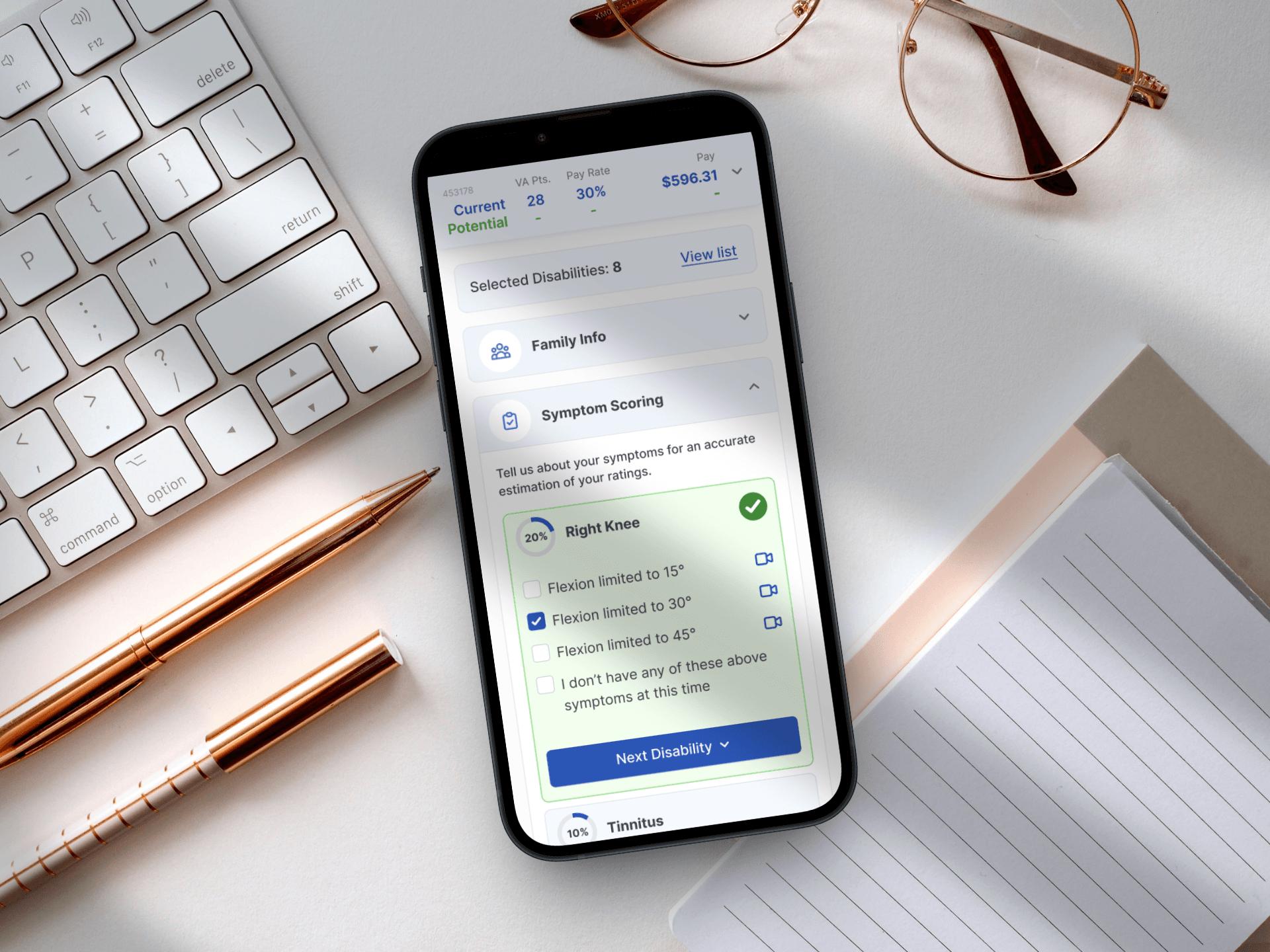
Designing for Service: A Mobile-First Veteran Benefits Calculator
Simplifying the path to government benefits by bridging the gap between complex legal algorithms and human-centered design.
Designing a System That Scales
Building a unified design foundation across products, teams, and code.