Designing for Service: A Mobile-First Veteran Benefits Calculator
Simplifying the path to government benefits by bridging the gap between complex legal algorithms and human-centered design.
Role
Senior Product Designer
Team
Stakeholder, Head of Product, PM, Designer, Dev team
Scope
Standalone tool - concept to MVP & post-launch iteration
My Role & Impact
Tasked directly by senior stakeholders, I led the complete design of this tool from concept to post-launch iteration - including the strategic pivot away from a Chat UI that would have spiked bounce rates by 20–30%. I defined the mobile-first multi-step framework, ran prototype testing via Maze, and personally audited 1,500+ session recordings to identify a critical 71% drop-off point. My data-led redesign cut that to 49%.
Owned: End-to-end design - concept, UX, UI, testing & post-launch iteration
Drove: Pivot to multi-step flow; prevented a high-friction Chat UI from shipping
Outcome: Bounce rate dropped from 71% → 49% through data-driven redesign
1500+
analyzed user session recordings
49%
to this we dropped the bounce rate
2
applications used for user testing
In December 2022, I was tasked directly by senior stakeholders with building a calculator to help veterans navigate the often confusing world of government benefits.
The Challenge
Initially, the request was for a "simple calculator." However, the systemic challenge was deeper: The veteran benefits landscape is a high-friction environment characterized by dense medical jargon and cognitive overload. The lack of an intuitive digital interface for these complex algorithms meant that veterans were either abandoning the process or flooding the support team with manual inquiries. The system needed to bridge the gap between government complexity and user-centric simplicity while scaling across devices.
Strategy: Mobile-First & Multi-Step Flow
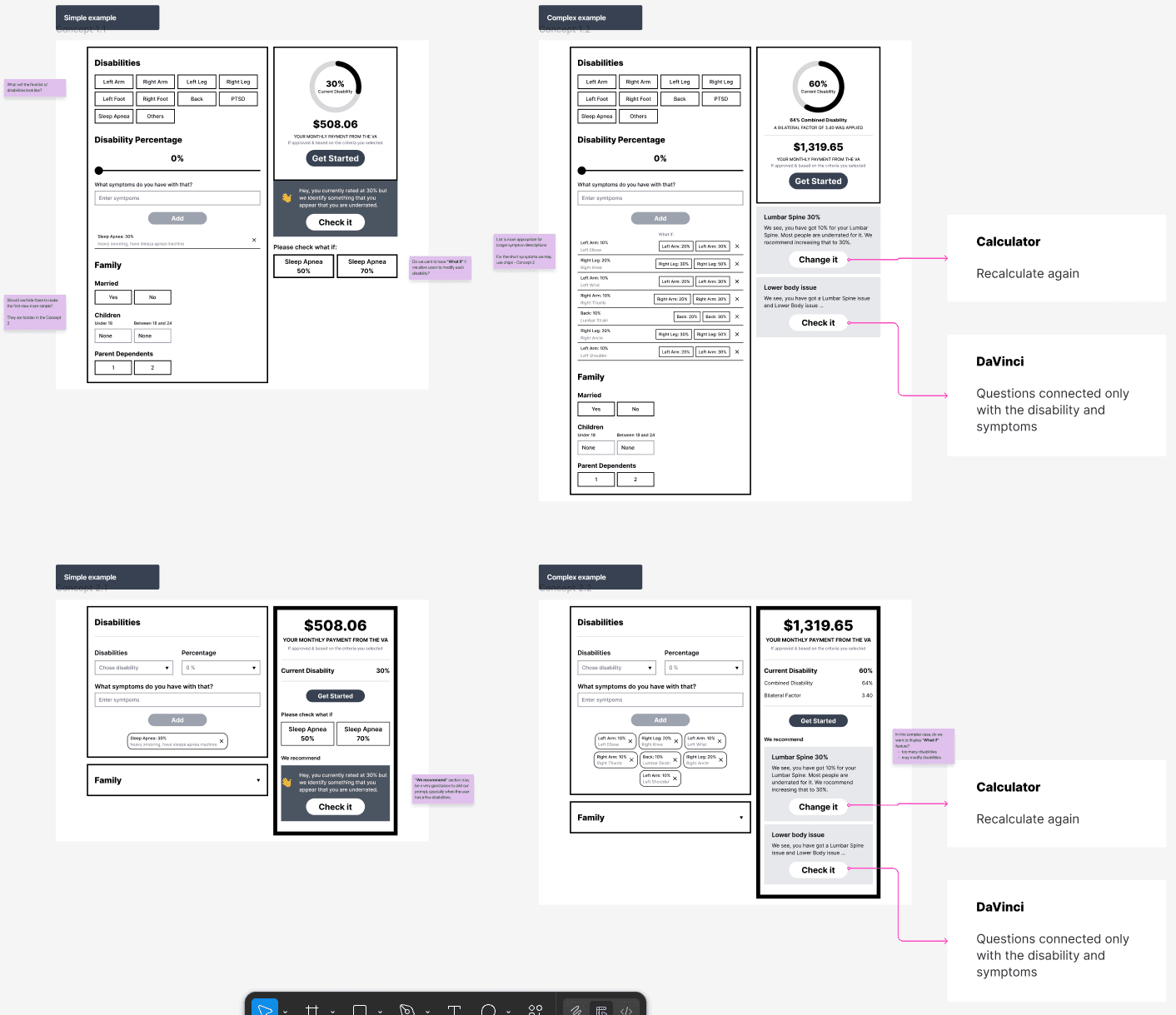
Diagnosis: Discovered that a "one-page" tool would fail as the scope grew. The density of data required a multi-step mental model to prevent user fatigue.
Proposal: Pivot from a "simple tool" to a structured, multi-step flow that functions as a guided service.
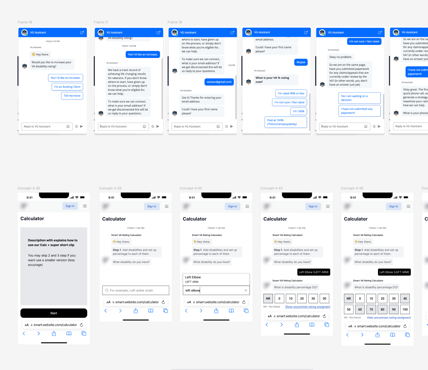
Cross-functional Alignment: Navigated the shift from a static calculation to an interactive report-generation tool. I aligned stakeholders on the move away from "Chat UI," proving it would increase time-to-completion and potentially spike bounce rates by 20-30% due to the sheer volume of data inputs.
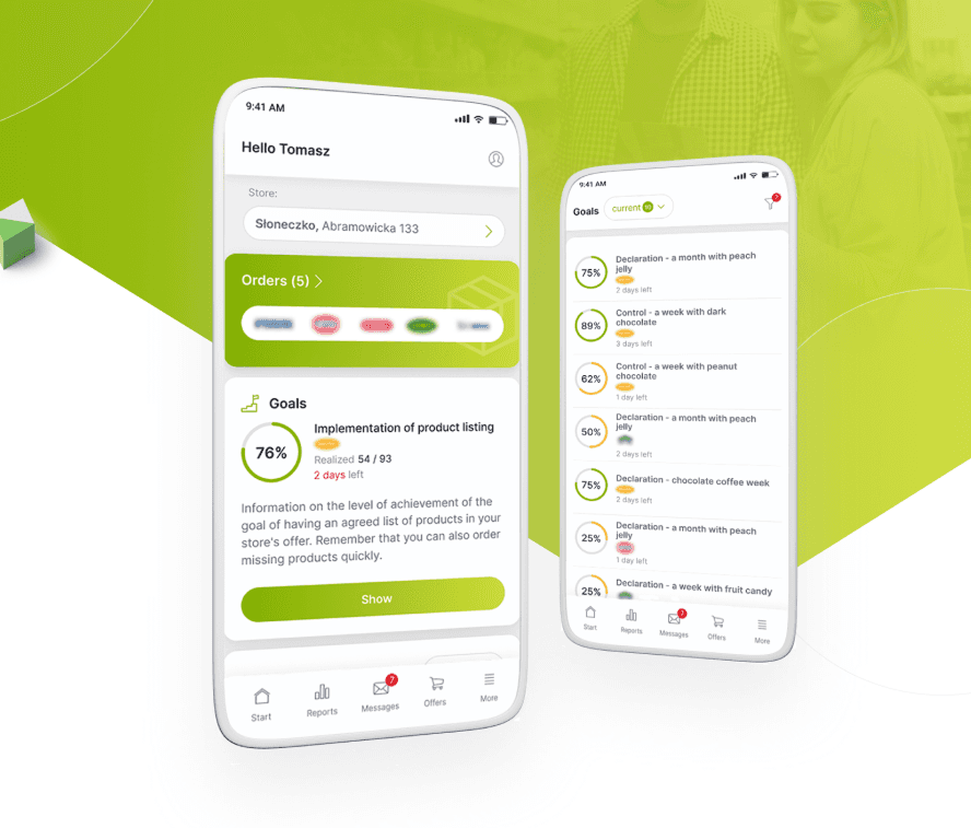
Trade-offs: We prioritized Mobile-First constraints (designing for the lowest common resolution) over desktop aesthetics to ensure 65% of our primary traffic had a seamless experience.
System Work: Building the Flow
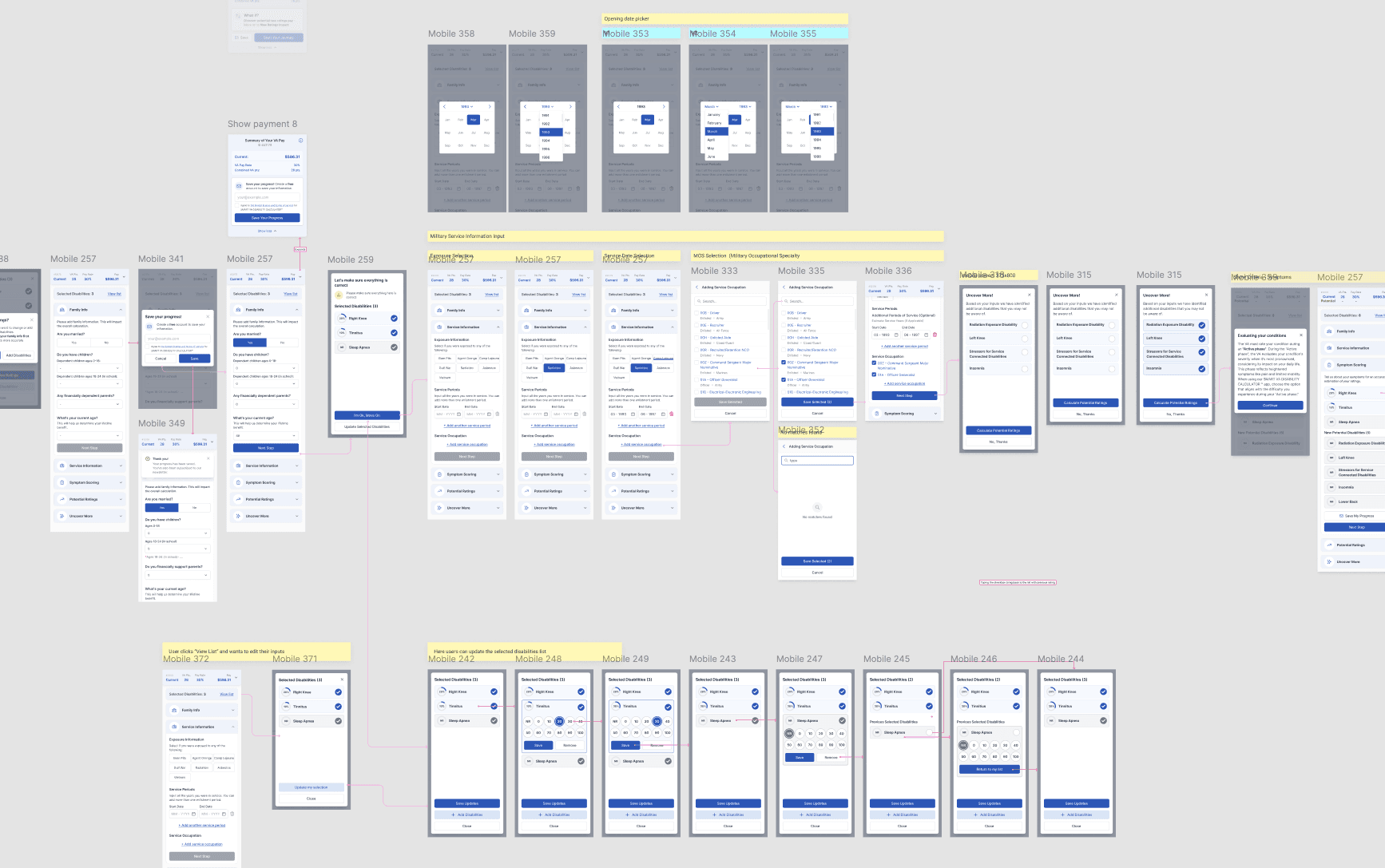
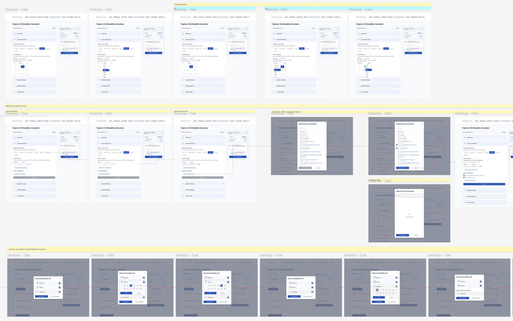
Instead of focusing on individual screens, I designed a modular interaction framework:
Information Architecture: Transitioned from a two-column desktop-centric layout to a vertical, linear progression.
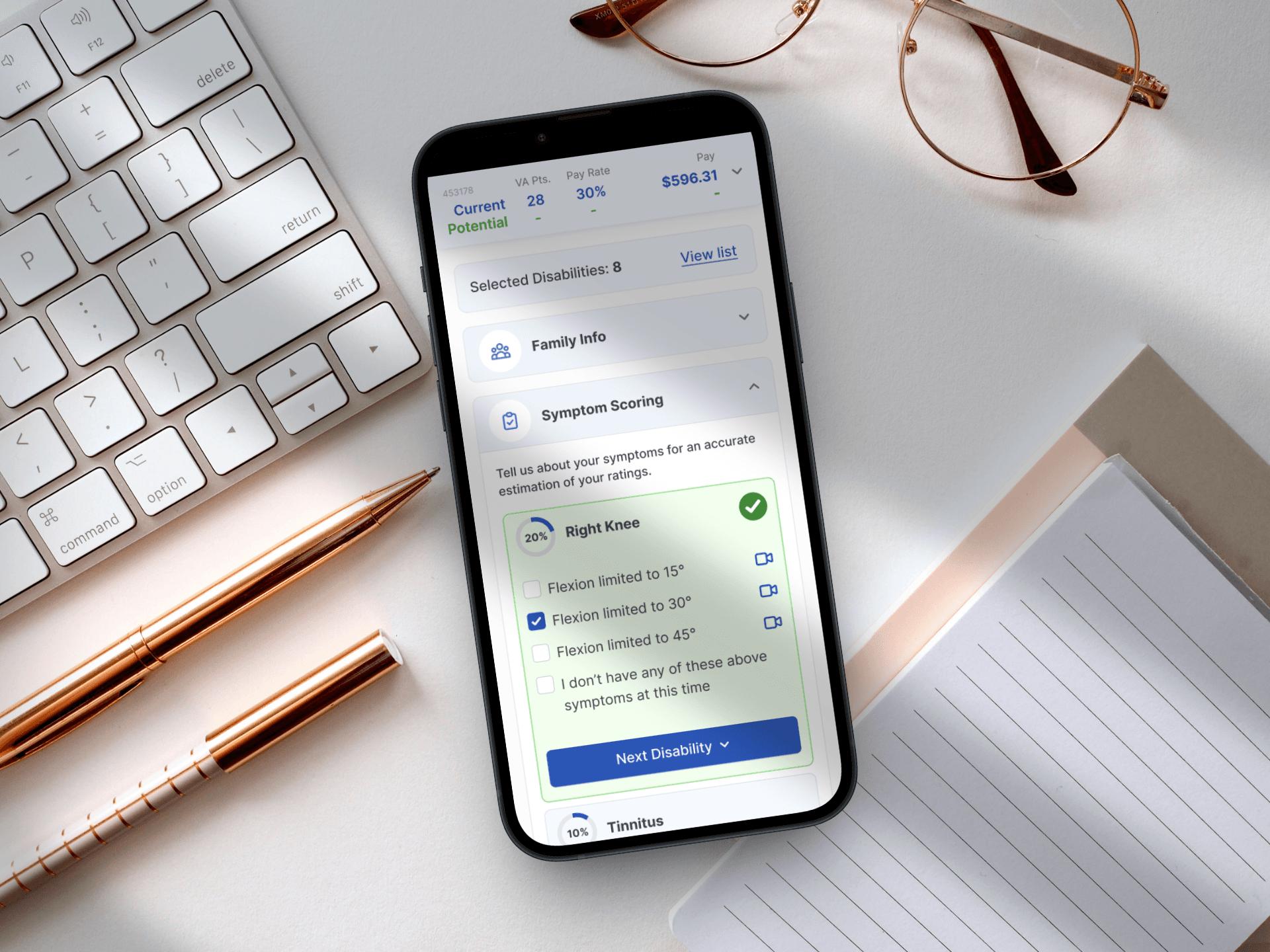
Component Strategy: Built a library of "Smart Inputs" that handled medical terminology and video hints natively, ensuring the UI remained clean despite the heavy data requirements.
Flow Logic: Implemented a branched logic system where user inputs dictated the subsequent questions, reducing irrelevant fields and shortening the "Time to Value."
Design System Integration: I translated our concepts into hi-fi screens using our existing design system, ensuring that the new "Progress" and "Summary" components felt like they belonged to the brand.
Delivery & Collaboration
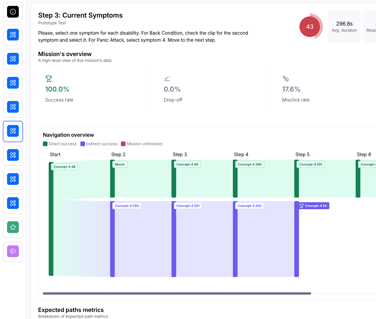
I didn't want us to build on guesswork. We used Maze to run mission-based tests on the prototype.
What we tracked: We looked at exactly where people abandoned the session and how long they spent on each screen.
The Human Touch: Open-ended questions in the tests helped us find the "pain points" where our language was still too formal.
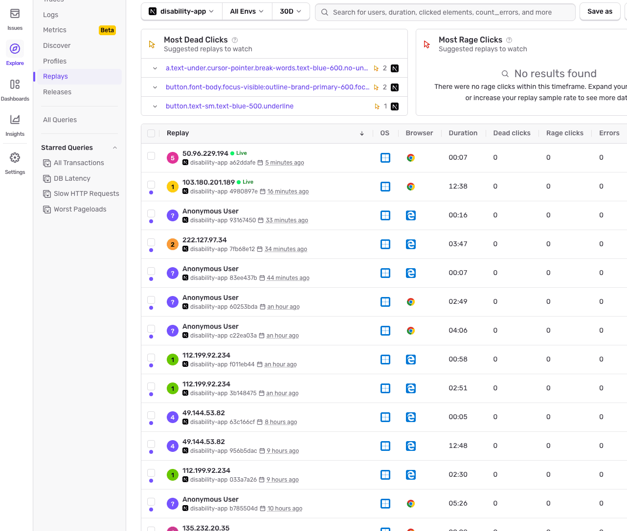
The Handoff: Once we delivered the designs, we didn't just "finish." We connected the MVP to session-recording tool (Sentry) so we could watch how veterans interacted with the tool in real-time.
Testing the MVP
After delivering Hi-Fi designs based on our internal design system, we launched an MVP. However, my work didn't stop at handoff.
The 1,500 Recording Audit: We connected session-tracking tools to the MVP. I personally analyzed over 1,500 recordings, grouping conclusions by priority to create a comprehensive User Journey Map.
Rapid Iteration: We found a critical drop-off point where the bounce rate hit 71%.

Key Outcomes
User: Bounce rate dropped from 71% → 49% after implementing automatic change-saving, improved question logic, and "blocker" explanations - driven entirely by analysis of 1,500+ session recordings.
User: Transitioned the tool's perception from a formal, intimidating medical form to an accessible service veterans felt comfortable completing on their phones - validated through open-ended Maze test responses.
Business: Prevented a costly misstep by steering stakeholders away from a Chat UI that would have increased time-to-completion and spiked bounce rates by an estimated 20–30% - saving a full redevelopment cycle.
Business: Established a permanent feedback loop - the session recording infrastructure put in place at MVP continues to inform product prioritisation, making the tool self-improving beyond the initial engagement.
What I learned
Design for the Extremes: Starting with the lowest possible mobile resolution ensured the tool was robust for everyone.
Data Silences Opinions: Analyzing 1,500 recordings allowed us to stop "guessing" what users wanted and start "solving" what they needed.
The System is Never "Done": The jump from Concept 1 to the current iteration taught me that a product must be built to absorb growth. By using a modular multi-step system, we could add new features without breaking the core experience.
Other projects

Building Faster: An AI-Assisted Homepage Redesign
Using Claude Code and Figma to define a design system, iterate on a homepage, and ship a token-based prototype - all in one connected workflow.
Digitizing the Veteran Journey: Connecting the Dots
Transforming a complex, phone-based claim process into a clear, task-driven digital experience.
From Excel Chaos to a Unified Retail Powerhouse
Orchestrating the end-to-end design and strategy of a responsive platform that unified fragmented legacy workflows into a high-velocity digital marketplace.
Designing a System That Scales
Building a unified design foundation across products, teams, and code.